We available for hire! — Need help with a web or mobile project?
From yensdesign we develop technology projects based on web apps, mobile apps, consulting and databases. We are young and hard workers, passionate about innovation and focused in new technologies.If you want to ask for a budget, we hare available for hire!.
Mastering CSS background-position
Hi there guys! As you may know, we have published a lot of tutorials to learn how to improve the interaction of our web applications mainly using javascript and jQuery. We have created our layouts for these tutorials using xHTML and CSS and this time the CSS part will be the important thing and not a simple spectator.
We will learn how to use the CSS property background-position to create different kind of buttons, interfaces and more by using only one image as background. It will reduce the loading time and supress the user’s waiting on mouse over effects.
As always, you can try the living example over here.
Tested in: Firefox, Internet Explorer 6 & 7, Opera, Safari & Chrome.
It will be an interesting (and funny) tutorial, come on guys!
Introduction
This time I am really happy and excited because I think this tutorial will help a lot of people and it will be very very easy to understand. I have noticed that a lot of people makes use of basic CSS properties to create their layouts but doesn’t know about other “advanced” CSS properties.
We are going to see how the background-position can improve the user’s experience of our visitors and reduce the time loading in our pages. Big sites like youtube, facebook and more make use of that property to save resources and get a better interaction.
As always we are going to advance step by step with simple and clean explanations. Let’s go!
The background-position CSS property
Before start with the code, it’s important to take a look at the values of the background-position:
- Definition: The background-position property sets the starting position of a background image.
- Values: You can use top, center and bottom followed by left, right and center (IE: “top left”), horizontal and vertical percentages x% y% or xpos ypos (IE: “10px 20px”).
- Want to know more about this property? Just go here.
As you may noticed with this property we can use one single image to obtain different background images in same / different divisions by combining background-position and background-image.
As you may supposed, background-image allow us to specify a background image for our elements and we will use it in combination with background-position to get our purposes.
So now that we know more about these two properties, we can begin with the code ![]()
Step 1: Explaining “The Trick”
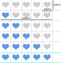
Now pay attention guys, with this simple but useful trick we are going to do all our tutorial examples. First of all, take a look at this:

Imagine we want to recreate a star ratings system, we would do something like that:
- Create an empty star
- Create a full star
- Make the over effects by using these two images
What’s the problem? We will have two images, so if the user moves the mouse over stars it will take a while to show the new full star image “full_star.jpg”.
But with our background-position trick we would do this:
- Create a single image with the empty and full star in the same image
- Make the over effects by using the single image
What happens now? Yeah, it won’t take time to show the new full star image because it’s already loaded in the single image!
Got it guys? ![]()
Well let’s move to the real part, we are going to do some real examples to show you this trick and to believe in what I am saying to you, of course ![]()
Step 2: The xHTML layout
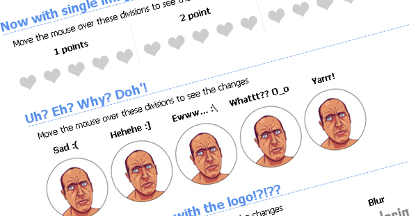
We are going to recreate 4 examples in 4 different divisions called:
- heart: Heart rate system using the trick
- alternate: Heart rate system without our trick, to compare and see the diference
- expresions: We will see how to use this trick to recreate funny expresions


- logo: Some effect in yensdesign logo
Before jump into the code I want to remember you this:
We are using more than one class at the same element to share CSS properties between different elements. For example: content heart, content expresions and so on…
So here you have the index.html code:
[code language="html"] [/code]
How much do you love yensdesign.com?
Move the mouse over these divisions to see the changes
1 points
2 point
3 points
4 points
5 points
Now with single images, see the difference?
Move the mouse over these divisions to see the changes
1 points
2 point
3 points
4 points
5 points
Uh? Eh? Why? Doh'!
Move the mouse over these divisions to see the changes
Sad

Hehehe :]
Ewww... :\
Whattt?? O_o
Yarrr!
What's is going on with the logo!?!??
Move the mouse over these divisions to see the changes
Opacity
Mirror
Blur
Red
Blue
Let’s go to the important part in this tutorial, the CSS part!
Step 3: The CSS Trick in Action!
Now we have created our HTML divisions we will add our tricks by using:
- background-image: To set our background image.
- background-position: To make the trick, changing the position of our background image.
- :hover event: We will make changes in each division when the user moves the mouse over them.
One more thing guys:
We are using the CSS property background to apply the background-image and background-position at a once.
Here you have the entire CSS code:
[code language="css"]
@CHARSET "UTF-8";
/******* GENERAL RESET *******/
html, body, div, span, applet, object, iframe, h1, h2, h3, h4, h5, h6, p, blockquote, pre, a, abbr, acronym, address, big, cite, code, del, dfn, em,
font, img, ins, kbd, q, s, samp, small, strike, strong, sub, sup, tt, var, dl, dt, dd, ol, ul, li, fieldset, form, label, legend, table, caption, tbody,
 tfoot, thead, tr, th, td {
border: 0pt none;
font-family: inherit;
font-size: 100%;
font-style: inherit;
font-weight: inherit;
margin: 0pt;
padding: 0pt;
vertical-align: baseline;
}
body{
	line-height: 14px;
	font-size: 12px;
	background: #fff;
	font-family: Tahoma, Verdana, Arial, Helvetica, sans-serif;
	margin: 0pt;
	cursor: default;

	/* fu?"!· explorer 6 !!! */
	behavior:url("css/csshover3.htc");
	/* fu?"!· explorer 6 !!! */
}
table{
	border-collapse: separate;
	border-spacing: 0pt;
}
caption, th, td{
	font-weight: normal;
	text-align: left;
}
blockquote:before, blockquote:after, q:before, q:after{
	content: "";
}
blockquote, q{
	quotes: "" "";
}
input, textarea, select{
	font-family: Tahoma, Verdana, Arial, Helvetica, sans-serif;
	font-size: 11px;
}
strong{
	font-weight: 700;
}
ul{
	list-style: outside;
}
a{
	cursor: pointer;
	color: #296ba5;
	text-decoration: none;
}
.clear{
	clear: both;
	height: 0;
	visibility: hidden;
	display: block;
}
/******* /GENERAL RESET *******/
h1{
	font-weight: 700;
	font-size: 18px;
	line-height: 1.2em;
	border-bottom: 1px dotted #6b9ef1;
	color: #5f95ef;
	margin-bottom: 0.5em;
}
/******* LOGO *******/
#logo{
	text-align: center;
	margin-top: 1em;
	display: block;
}
/******* /LOGO  *******/
/******* CONTAINER *******/
#container{
	width: 960px;
	margin: 40px auto;
	text-align: left;
}
#container p{
	margin: 0 0 12px 12px;
}
/******* /CONTAINER *******/
/******* CONTENT *******/
div.content span{
	display: block;
	font-weight: 700;
	color: #898989;
	margin-top: 10px;
}
div.content{
	padding: 0;
	margin-bottom: 20px;
}
/******* /CONTENT *******/
/******* SECTIONS *******/
.content .section{
	float: left;
	width: 180px;
	margin-right: 4px;
}
.content .section h2{
	font-size: 12px;
	font-weight: 700;
	display: block;
	text-align: center;
	margin-bottom: 9px;
}
/******* /SECTIONS *******/
/******* HEARTS *******/
.content.heart .section{
	border-right: 1px solid #efefef;
}
.content.heart .section .icons{
	height: 36px;
	background: transparent url(images/background.jpg) no-repeat scroll 0px 0;
}
.content.heart .section.one:hover .icons{
	background: transparent url(images/background.jpg) no-repeat scroll 0px -36px;
}
.content.heart .section.two:hover .icons{
	background: transparent url(images/background.jpg) no-repeat scroll 0px -72px;
}
.content.heart .section.three:hover .icons{
	background: transparent url(images/background.jpg) no-repeat scroll 0px -108px;
}
.content.heart .section.four:hover .icons{
	background: transparent url(images/background.jpg) no-repeat scroll 0px -144px;
}
.content.heart .section.five:hover .icons{
	background: transparent url(images/background.jpg) no-repeat scroll 0px -180px;
}
/******* /HEARTS *******/
/******* ALTERNATEHEARTS *******/
.content.alternate .section{
	border-right: 1px solid #efefef;
}
.content.alternate .section .icons{
	height: 36px;
	background: transparent url(images/zero.jpg) no-repeat;
}
.content.alternate .section.one:hover .icons{
	background: transparent url(images/one.jpg) no-repeat;
}
.content.alternate .section.two:hover .icons{
	background: transparent url(images/two.jpg) no-repeat;
}
.content.alternate .section.three:hover .icons{
	background: transparent url(images/three.jpg) no-repeat;
}
.content.alternate .section.four:hover .icons{
	background: transparent url(images/four.jpg) no-repeat;
}
.content.alternate .section.five:hover .icons{
	background: transparent url(images/five.jpg) no-repeat;
}
/******* /ALTERNATEHEARTS *******/
/******* LOGO *******/
.content.logo .section .icons{
	height: 40px;
	background: transparent url(images/background.jpg) no-repeat scroll -180px 0;
}
.content.logo .section.one:hover .icons{
	background: transparent url(images/background.jpg) no-repeat scroll -180px -40px;
}
.content.logo .section.two:hover .icons{
	background: transparent url(images/background.jpg) no-repeat scroll -180px -80px;
}
.content.logo .section.three:hover .icons{
	background: transparent url(images/background.jpg) no-repeat scroll -180px -121px;
}
.content.logo .section.four:hover .icons{
	background: transparent url(images/background.jpg) no-repeat scroll -180px -162px;
}
.content.logo .section.five:hover .icons{
	background: transparent url(images/background.jpg) no-repeat scroll -180px -202px;
}
/******* /LOGO *******/
/******* EXPRESIONS *******/
.content.expresions .section{
	width: 92px;
}
.content.expresions .section .icons{
	height: 90px;
	background: transparent url(images/background.jpg) no-repeat scroll -450px 0;
}
.content.expresions .section.one:hover .icons{
	background: transparent url(images/background.jpg) no-repeat scroll -360px 0px;
}
.content.expresions .section.two:hover .icons{
	background: transparent url(images/background.jpg) no-repeat scroll -360px -90px;
}
.content.expresions .section.three:hover .icons{
	background: transparent url(images/background.jpg) no-repeat scroll -360px -182px;
}
.content.expresions .section.four:hover .icons{
	background: transparent url(images/background.jpg) no-repeat scroll -360px -280px;
}
.content.expresions .section.five:hover .icons{
	background: transparent url(images/background.jpg) no-repeat scroll -360px -370px;
}
/******* /EXPRESIONS *******/
[/code]
Let’s explain the interesting parts…
We are making use of the csshover3.htc in the CSS to allow the :hover at our divisions. Microsoft Internet Explorer 6 only allows it on a link elements… Thank you Peterned!
As we said, we are making use of the background CSS (instead of write background-position and image by separate):
background: desired_color url(pat_of_the_image.jpg) no-repeat scroll horizontal_value vertical_value;
In our case, we are using a transparent color as background color, with no repeat and always with the same image for each section.
So we only need to change this values with our desired values in each :hover for all elements. Do you remember the previous image?

In this case it’s very easy to know how many pixels we must move the background-position, just catch 180 of width and move 36pixels in vertical for each value of our heart rate syste.
In the other hand, we have configured a second heart rate system with the old method to let you try the difference between the 2 methods, with and without the CSS trick. Is it appreciable, uh? ![]()
Step 4: Trying our example
And that all guys! Sorry if I not explained it well (you know, my english still sucking…) but if you got the idea, you will find this trick very useful. I hope you can use it to improve your personal projects as always ![]()
You can try the tutorial online here to see how It is working and download here all sources.
Remember guys that the second example of our heart rate system is created without the CSS trick, checkout the difference!
Remember that you can solve your doubts in our forums and follow us on Twitter to know more about what are we doing in any moment!
See you on next tutorial and remember that we want you suggest tutorials to write!
We provide best quality 350-018 design tutorial and 640-460 guide to help you learn how to make your website more interactive using javascript and jaquery. Learn how to create different types of buttons, interfaces and web background with 312-50 course.
Enjoy this post?
Your vote will help us to grow this website and write more entries like this one :)
We available for hire! — Need help with a web or mobile project?
From yensdesign we develop technology projects based on web apps, mobile apps, consulting and databases. We are young and hard workers, passionate about innovation and focused in new technologies. We try to help you, sharing our knowledge acquired on worked projects, while helping the community and showing our capabilities.If you want to ask for a budget, we hare available for hire! Don't doubt in get in touch with us!.


MUY BUENO!!
Por poner alguna pega decir que personalmente me molesta que se ponga todo el código css y html a la hora de desglosarlo, se acaba llenando el tuto de paja y quita protagonismo y claridad al tema central.
@Demiurgo Thanks for your comments
cool!

thx for share..
Hi,
thanks for sharing but is it working with transparent PNG on IE6 ?
Thanks
@adrien Thanks for posting! I am not sure, I didn’d tested with transparent PNG but I know there are some fixes to PNG on IE6 and now, including background-position: http://www.twinhelix.com/css/iepngfix/
Tell us if it works please!
Es un truco genial, muy ingenioso. Sobre todo pq como bien has dicho, reduce el tiempo de carga de las imágenes para el usuario, ya que sólo carga una imagen.
Genial!
1 saludo!
Great tutorials. I used to use this a lot but I’ve gotten lazy over the past year and have tried to avoid the use of CSS image rollovers if possible Think it was an unconscious decision.
[...] Mastering CSS background-position yensdesign – Tutorials, Web Design and Coding (tags: css) [...]
I used to see that the same background image had two different images inside it when I used to click on the “View Background Image” context menu feature in firefox, and wonder what’s going on… This solves the puzzle, thanks!
Great tutorial, thanks alot.
Lol unconscious decisions usually turn out to be very bad.
Thanks For Information, i have problem for 3*3 web site position for image in website! thanks for the info!!
i just fixed a problem on my project. thanks for the great post!!
why all are using background:transparent none no-repeat scroll; tag? pls expling as soon as possible thank you
Hi! Nice tut!
Only one thing about the “heart rating” system:
An image with 5 filled hearts beside 5 empty ones would be enough for the sake of the example.
But, OTOH, this would make the reader to lose focus on the subject.
I like your blog, sure I’ll be visiting it again.
Greetings!
I found your blog on google and read about 8 more of your other posts. I just added you to my Google News Reader. Keep up the well-done work Look forward to reading more from you in the future. Warm regards
Nice post! Just out of curiosity, is it possible to add a link to the image? I’ve been trying to achieve this but I seem to be getting nowhere!